|
Email not displaying correctly? View it in your browser. |
|||||||||
|
Once a design is done and works, most people don't question it. A designer will however notice the smaller details like:
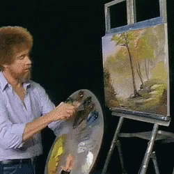
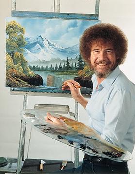
Creating repetition is key to bringing a design together. It is one of the principles of design. The light blue color was used to re-enforce the feeling of tranquility and softness, much like Bob Ross. The patterned background was kept light as to not distract from the main content of the email.
Accessibility is also important. As a developer, I had to think about the layout and how the whole design loads. Using images in the 'png' format keeps file size down which increases downloading speed. Adding a "view in browser" link at both the top and the bottom of the email gives a email recipient more choices on how to view the content. Including alt text on all of the images is also important for SEO.
Fill out the form below and I will get back to you ASAP!